What Is a Language Selector?
A language selector is a part of a website or app that lets visitors pick their preferred language for viewing content. It helps users switch between available languages, making the site easier to use and understand.
Language selectors are important for multilingual websites because they make content accessible and user-friendly for people around the world.
Common Types of Language Selectors:
- Dropdown menu – a clickable list that shows available languages.
- Inline text links – direct links labeled with language names.
- Button toggles – works well for sites with two language options.
- Flag-based icons – visual representations (be careful with these; flags represent countries, not languages).
- Modal selectors – pop-up windows for language choice, often shown on first visit.
- Persistent banners or panels – unobtrusive selectors that stay visible while browsing.
- Autocomplete search fields – helpful when you have many language options.
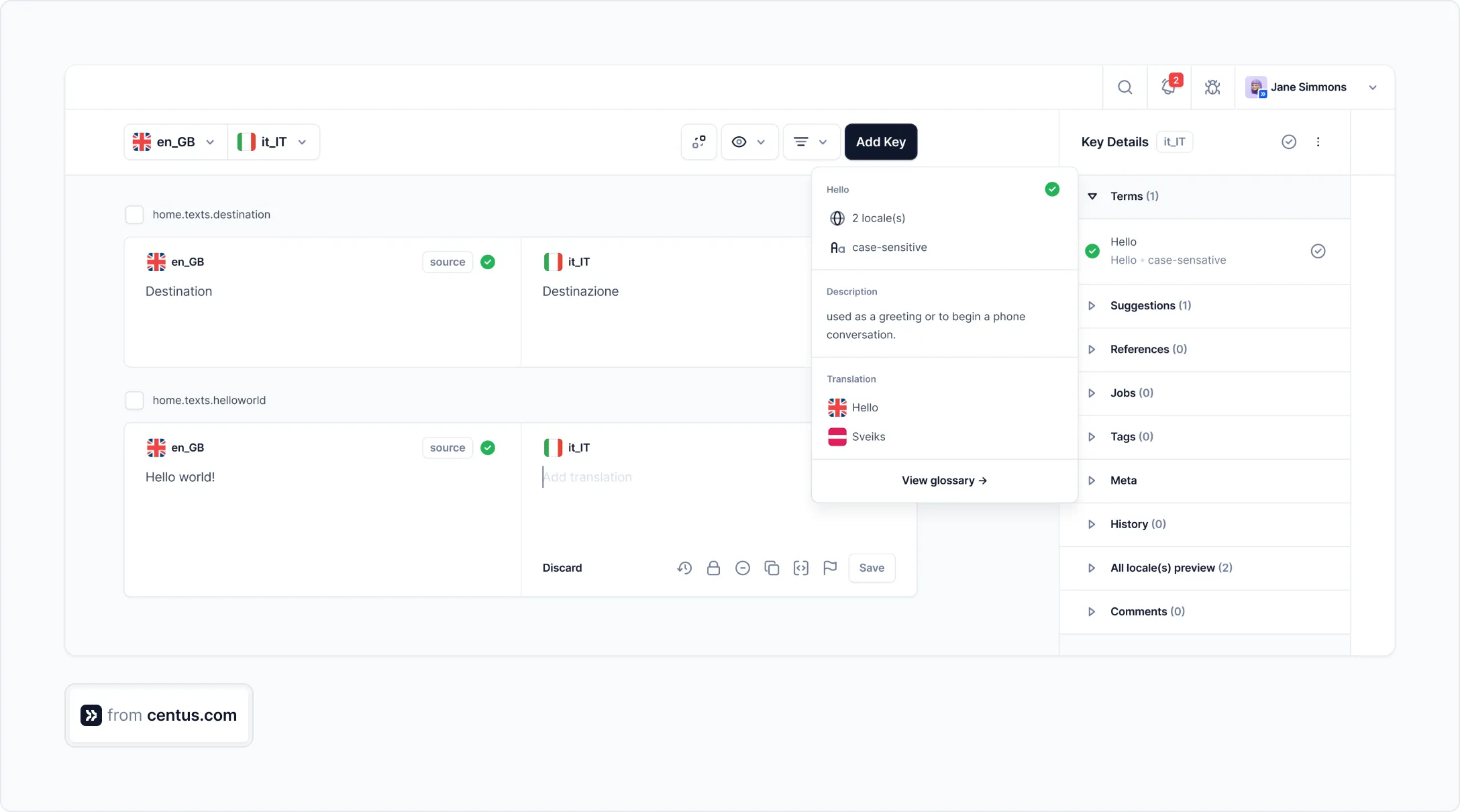
Pro tip: When you localize your website, make sure to coordinate multiple language versions properly — Centus localization platform makes this process simple for your team.
Website Language Selector UX: Tips & Best Practices
Make the Language Selector Easy to Find
If someone lands on your site and can’t spot the language selector, you’ve already lost them. It should be obvious—not tucked away in a submenu. Most users look for it in the top-right corner or at the bottom of the page. These aren’t guesses—they’re habits formed by years of browsing. You can even place the language menu in both spots to cover more ground, especially on long, scroll-heavy pages. A missing or hidden language toggle sends the wrong message: “This site isn’t for you.”
Example: Atlassian tucks a language selector icon into the footer; Airbnb puts one in the header with a globe. Both placements work because users don’t have to think—they just find.
Use Globally Recognized Icons
You don’t need to reinvent the wheel. When it comes to representing language choices, the globe icon has become the universal shorthand. It’s immediately recognizable across cultures. Add a simple label like “Language,” and you’ve done your job. Just make sure it's legible and stands out—contrast matters, especially for users with visual impairments. Tooltips are a small touch, but they help too.
Example: Monday.com keeps it simple—a globe icon right in the header, clear and easy to spot.
Use Autocomplete in Language Dropdowns
Scrolling through dozens of language options isn’t efficient—especially on a small screen. That’s where autocomplete makes a huge difference. As soon as users start typing a few letters, the language dropdown should filter itself in real time. This isn’t just faster—it reduces the mental effort required to hunt through a long list.
Autocomplete becomes even more critical on mobile. Thumb-scrolling through twenty or more items is frustrating. By letting users type, you’re acknowledging that precision matters.
Example: IBM’s select language UI includes autocomplete. It saves time and keeps users focused on their task.
Avoid Using Country Flags for Languages
It’s a common mistake: using flags to represent languages. But flags don’t speak—they represent governments, borders, and politics. Languages, meanwhile, often transcend those boundaries. Take Arabic. Or Spanish. Or English. One language, many countries, many dialects.
Using a flag to stand in for a language introduces confusion—and sometimes alienation. It’s a visual shortcut that doesn’t work. Worse, it can make users feel excluded if their region isn’t represented.
There’s a better way: just use text. Paired with a clean language selection UI design, native labels are all you need.
Example: Restaurant Cléo avoids flags entirely in its language selection UI. The result? A cleaner, more neutral experience that works for everyone.
Use Flags for Country Selection Only
Flags can work—but only when you're asking users to select a country, not a language. When the goal is to set a shipping location, regional content, or currency preferences, country flags offer a quick, recognizable visual cue. They make scanning easier, especially when paired with text labels.
But here’s the critical bit: don’t blur the lines. Your users need to understand the difference between selecting a country and choosing a language. The two are not interchangeable. The language selector should be clearly labeled and visually distinct from the country picker.
Example: Bol.com uses flags to help users choose between country-specific versions of its site, but sticks with text when it comes to the language options.
Don’t Use Abbreviations or Initials Alone
Labels like "EN," "FR," or "DE" might save space, but they often cost you clarity. Especially when browser extensions or automated translation tools get involved—those two-letter codes can turn into something unreadable or misleading. Some users won’t know what they mean at all.
That’s why abbreviations should never stand alone. Pair them with the full native name of the language to avoid confusion. “EN - English” works. Just “EN” doesn’t.
Example: On Decathlon’s mobile site, using shorthand caused unpredictable results when translations kicked in—making the language selection UI harder to understand.
Group Related Options Effectively
When you have more than a handful of language options, how you organize them matters. Long, unstructured lists make users work harder than they should. But smart grouping—by continent, region, or even popularity—makes navigation faster and more intuitive.
Tabs, collapsible menus, categorized sections—whatever works with your design, as long as the structure is clear and consistent. People shouldn't have to scroll endlessly just to find what they need.
Example: Dell uses tabbed regions to help users browse by area; eDreams breaks up its country list with accordion sections, keeping the interface tidy and scannable.
Always Provide a Manual Override
Guessing someone’s preferences based on their location or browser settings might seem helpful—but it’s risky. A user visiting from Tokyo might speak fluent French. Someone on a business trip in São Paulo might want English. The best approach? Offer a clear, persistent way for them to manually choose their language—regardless of where they are or what their browser thinks they want.
Let users override any assumptions. Don’t bury the option; make it visible from the start.
Example: BMW avoids auto-redirects. Instead, it displays a straightforward modal that lets visitors pick both their preferred language and region right away.
Decouple Language, Location, and Currency
People don’t always follow geographic defaults. A developer in Germany may prefer to browse in English and pay in USD. Someone in Canada might read French but want to transact in CAD. The point is: language, region, and currency are personal choices—not necessarily tied together.
When building a language menu, treat these as separate settings. Give users the freedom to mix and match based on their preferences.
Example: Airbnb’s interface gets this right. It breaks these options into distinct tabs, letting users configure each independently—language, location, and currency—without confusion.
Use Modal or Non-Modal Selectors Thoughtfully
Modals can be powerful. They force users to focus. That’s useful when you need them to make an immediate decision, like selecting a language selector UI during their first visit. But modals can also be annoying—especially if they block content or feel too aggressive.
If you use them, keep them simple and dismissible. For more subtle cases, non-modal options like sticky banners or collapsible panels can gently guide users without derailing their session.
Example: Patagonia goes with a non-modal language selector UI tucked into the corner of the screen. It’s always there—but never in the way.
Consider Language Selector Variants for Few Languages
When your site only supports two languages, don’t overcomplicate it. A language dropdown is unnecessary overhead for a binary choice. Instead, use clearly labeled buttons or a toggle. No extra clicks. No guesswork.
Side-by-side buttons give users immediate clarity. Each option is visible at once, and the interaction is fast. It's better UX—and faster for everyone.
Example: Gardette Industries keeps it lean and effective with two buttons: English and French. No dropdown, no confusion.
Follow Accessibility Standards
A language selector that looks great but doesn’t work for everyone isn’t doing its job. Make sure your UI follows accessibility standards like WCAG 2.1 AA.
That means:
- Using semantic HTML elements
- Ensuring keyboard navigation works
- Applying proper lang attributes < html lang="en"> for each page
- Maintaining strong color contrast for visibility
- Avoiding any functionality that relies on JavaScript alone
Avoid Auto-Redirects Based on Location Alone
Redirecting someone based on their IP address or browser language might sound like a shortcut, but it often backfires. Users end up on a version of the site they didn’t want. Maybe they’re traveling. Maybe they’re multilingual. Either way, assumptions break things.
A better alternative? Show a banner or modal that suggests a language switcher — but leaves the final call to the visitor. That keeps them in control, and your UX doesn’t get in the way.
Example: IKEA gets this right. Users are shown options to select their language and region themselves—no surprise redirects, no frustration.
Use Progressive Enhancement
Your language selector shouldn’t fall apart when JavaScript is turned off. In environments with strict firewalls, outdated browsers, or aggressive privacy settings, scripts can fail or be blocked. That’s why fallback support matters.
Use progressive enhancement: start with solid, plain HTML links or forms that let users switch languages reliably, even in limited conditions. Layer in JavaScript only for extra polish, not essential functionality.
Example: The W3C uses a simple language menu with basic links. It works everywhere—no fancy dependencies required.
Use URL Parameters or Subdomains for Language Versions
If someone bookmarks a page in Spanish, that link should bring them back to the Spanish version. If they share it with a friend, same deal. That only works if each language has its own dedicated URL.
There are two common ways to handle this:
- Subdirectories like /es/ or /fr/
- Subdomains like es.example.com
Both approaches are SEO-friendly and help users stay oriented. Whatever you choose, consistency is key. Also, don’t forget to use hreflang tags.
Example: Centus.com structures its pages by language—/ar/ for Arabic, /de/ for German—making every version easy to find, share, and revisit.
Localizing your website? Centus can help!
Centus is a powerful localization management suite that helps businesses efficiently deliver content in multiple languages. It streamlines the entire localization process—from translation workflows to team collaboration—making it easier to manage multilingual content at scale.
-
Seamless integration
Centus connects effortlessly with your existing tools and code repositories—no major rework required. -
User-friendly interface
Built for simplicity, Centus is easy to navigate without technical expertise, so teams can get started quickly. -
Advanced CAT tools
Accelerate translation with machine translation, segmentation, translation memory, glossaries, and other productivity boosters. -
Automated quality assurance
Run detailed QA checks to catch errors and maintain consistency across all content. -
End-to-end localization
From translation and design localization to reporting and payment tracking, Centus covers every step of the localization workflow.
Ready to optimize your website localization process? Give Centus a try!
Get the week's best content!
By subscribing, you are agreeing to have your personal information managed in accordance with the terms of Centus Privacy Policy ->
Keep learning

7 min. read
How to Make a Multilingual Website in 6 Steps

14 min. read
Website Localization: A Beginner’s Guide
10 min. read
What Is UI and UX Localization
15 min. read
ISO Country and Language Codes: The Definitive Guide

8 min. read
Key Localization Challenges and Solutions in 2025

7 min. read